Jarvis Boards | Brand Evolution
Turning the tide. Jarvis repositions for growth.
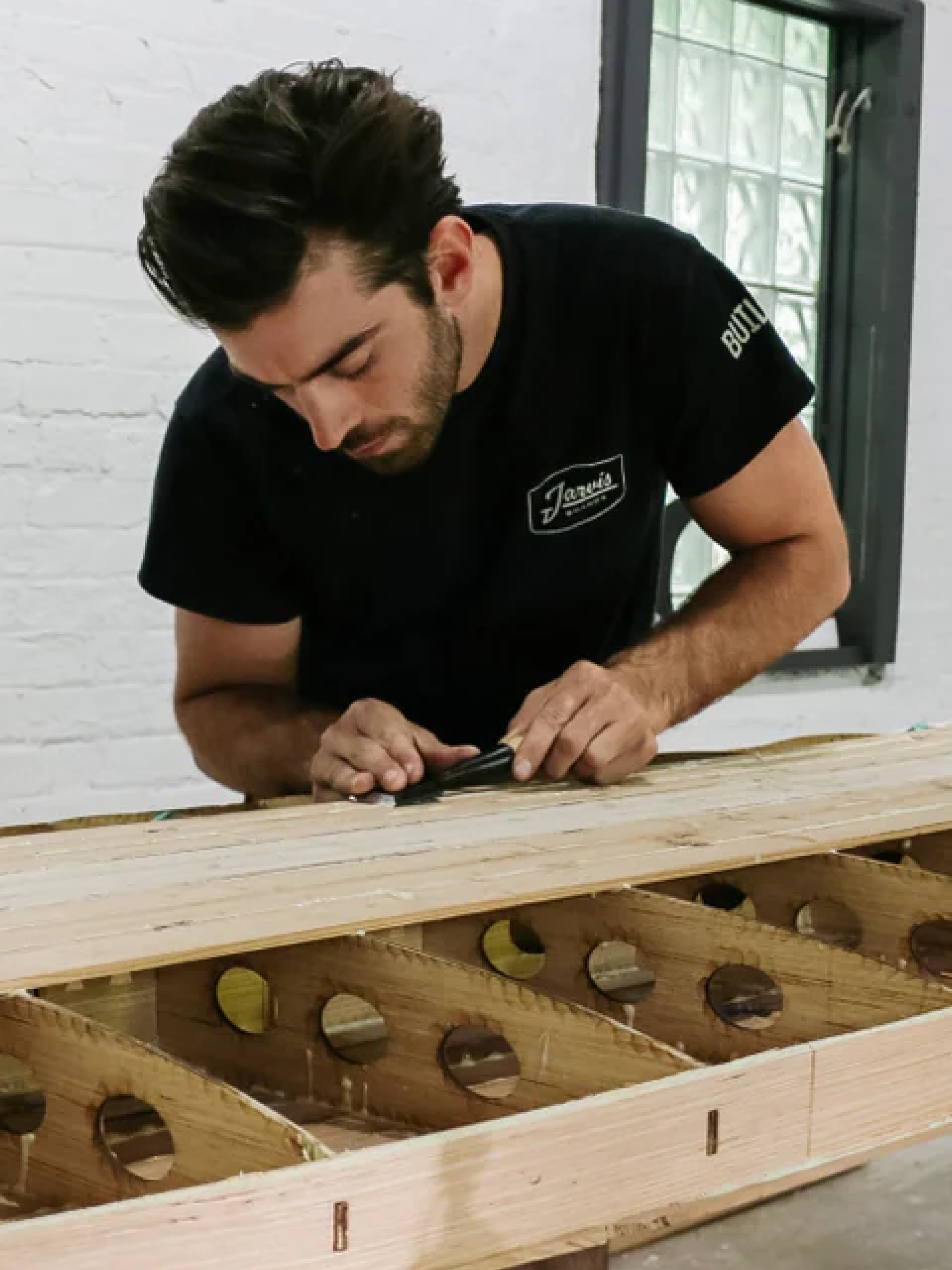
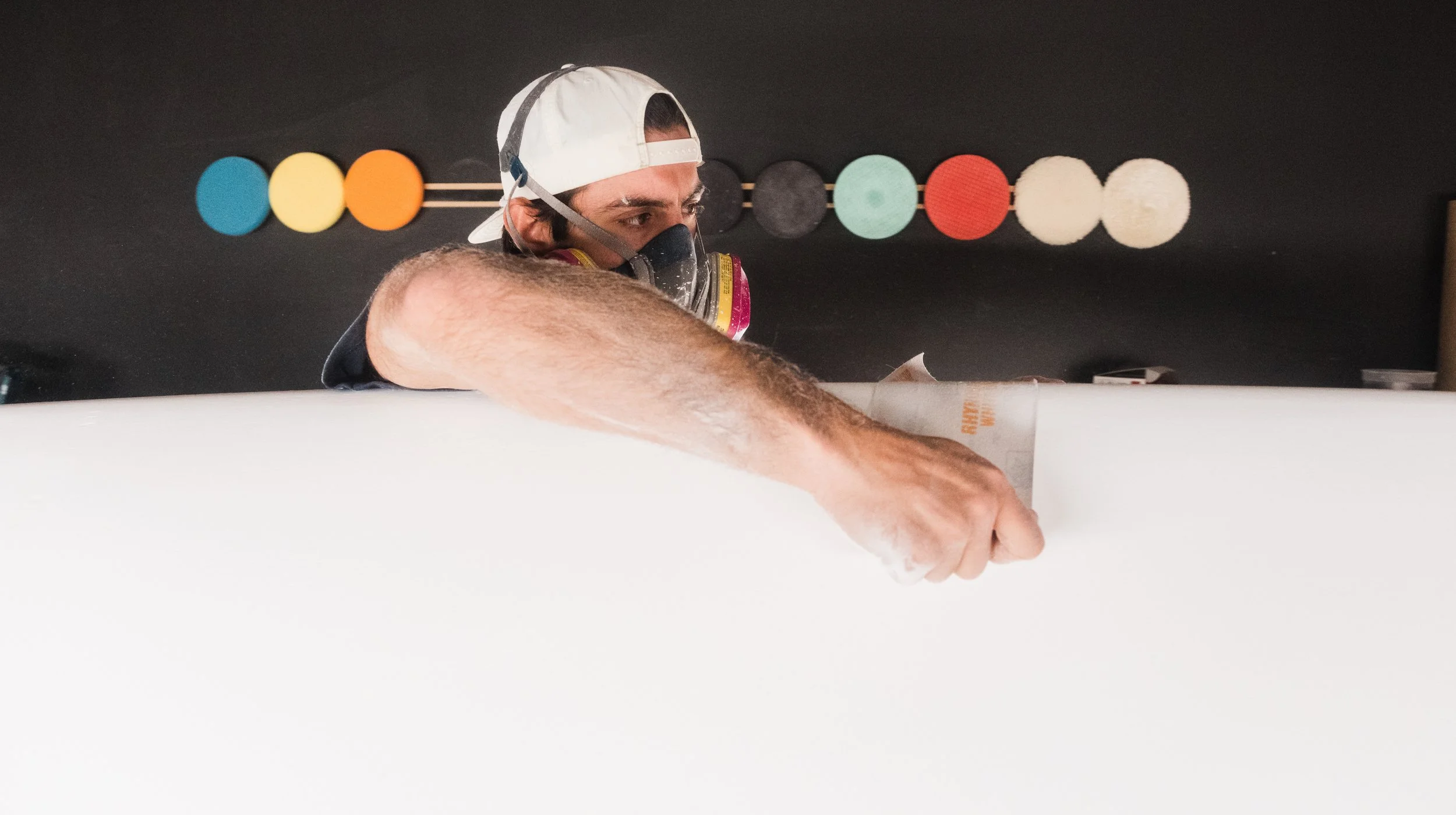
When entrepreneur and lifelong maker Eric Roberts acquired Jarvis Boards, he wasn't simply purchasing a paddleboard company. He was inheriting a brand with an enthusiastic following, a history rooted in DIY craftsmanship, and an opportunity to create something much bigger.
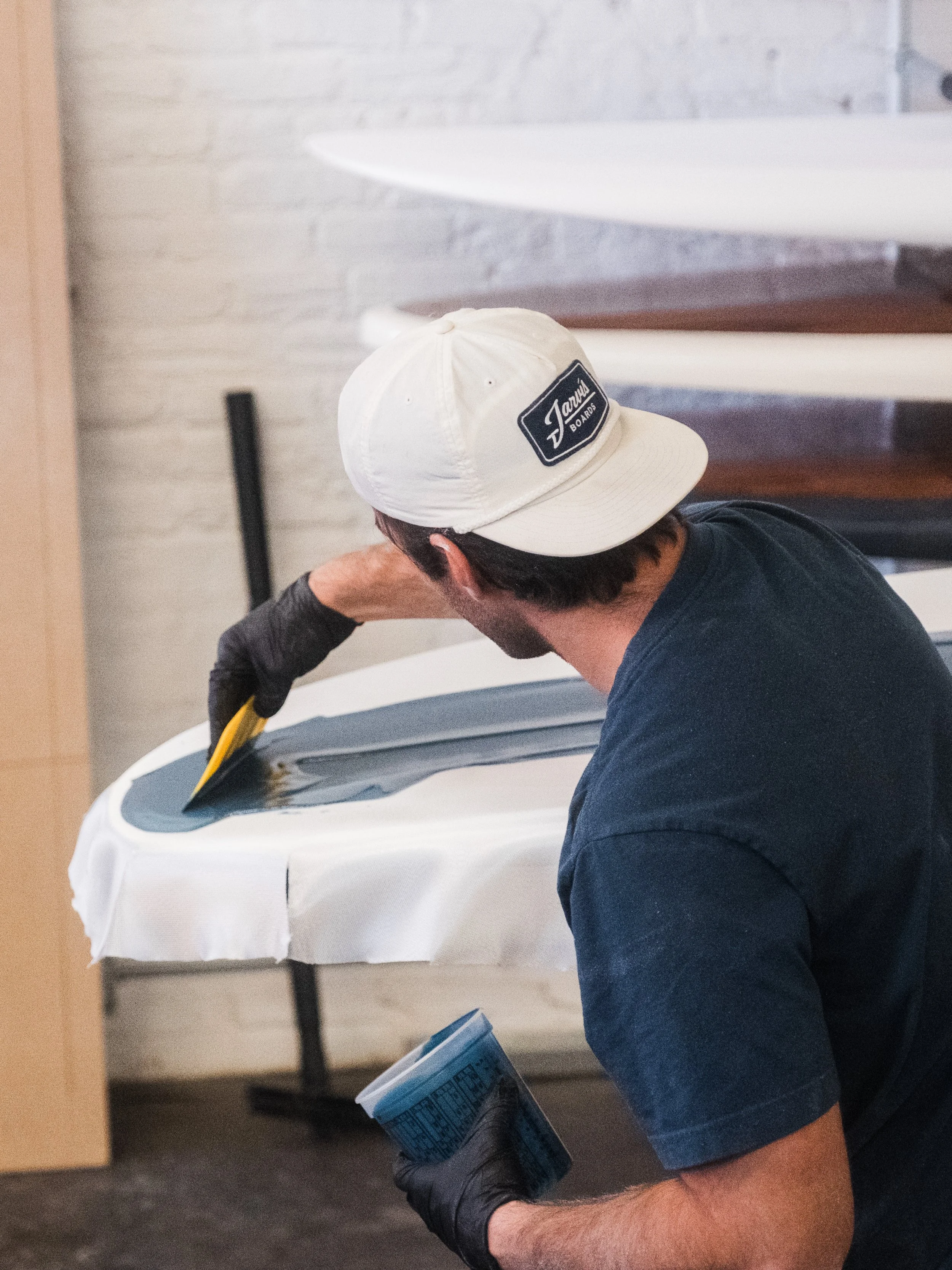
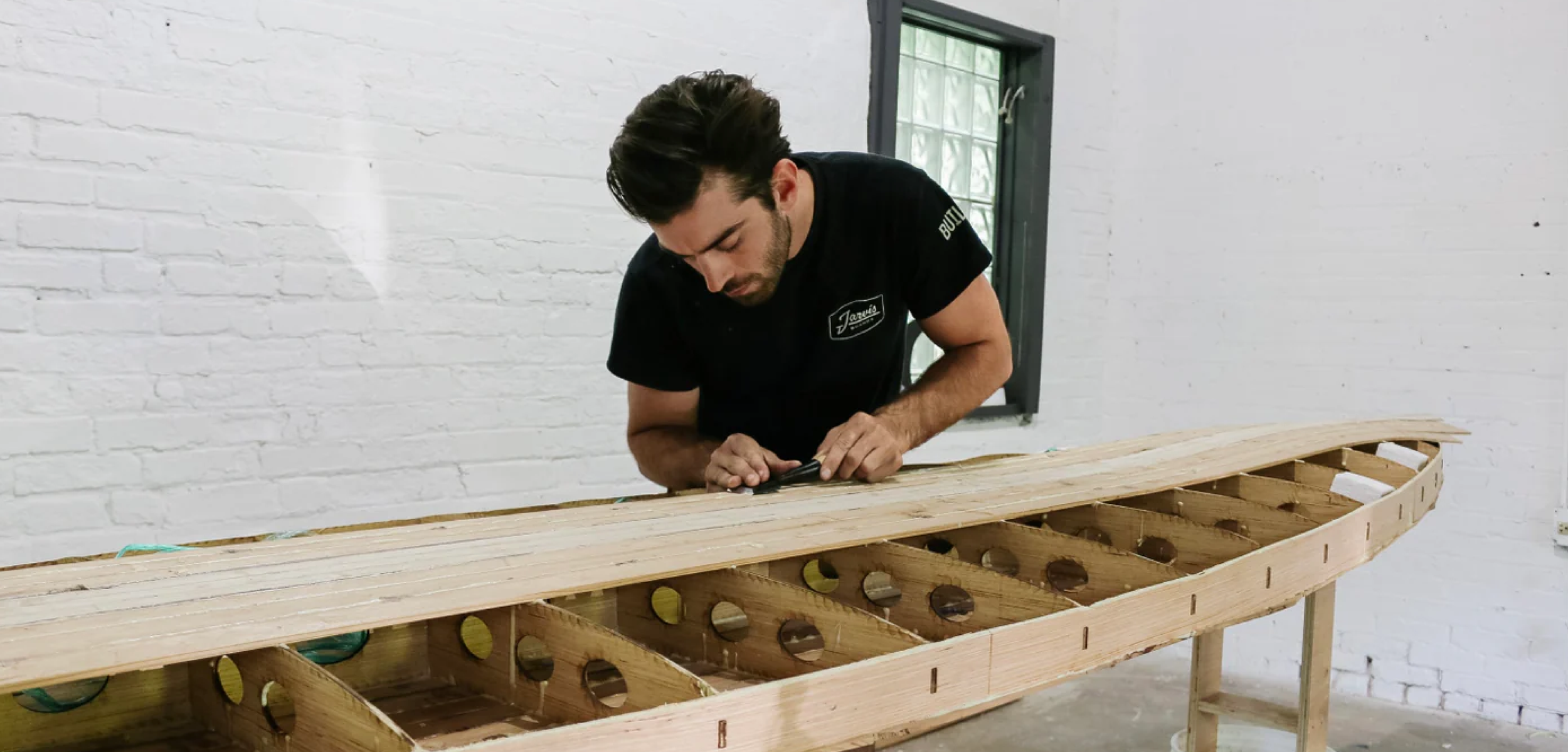
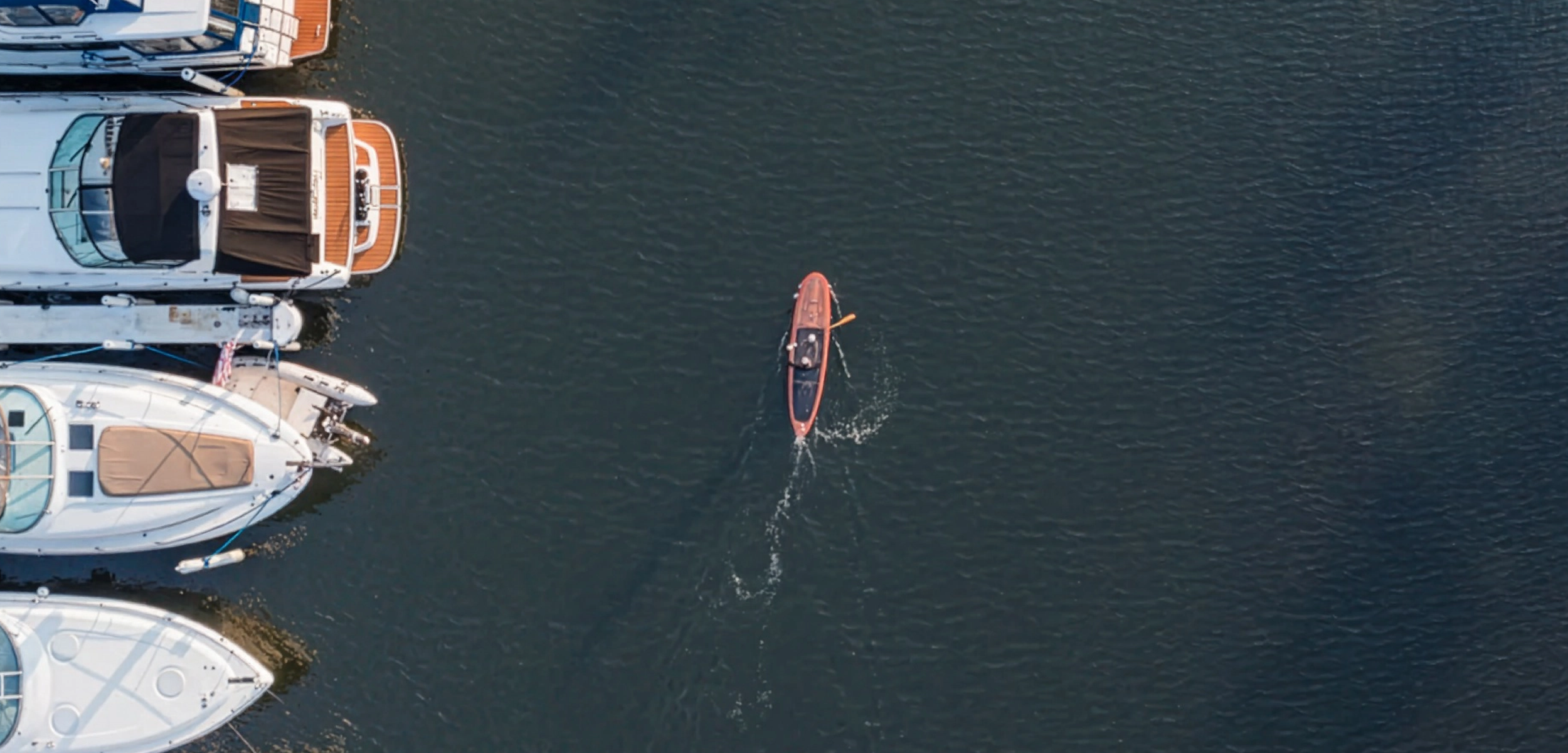
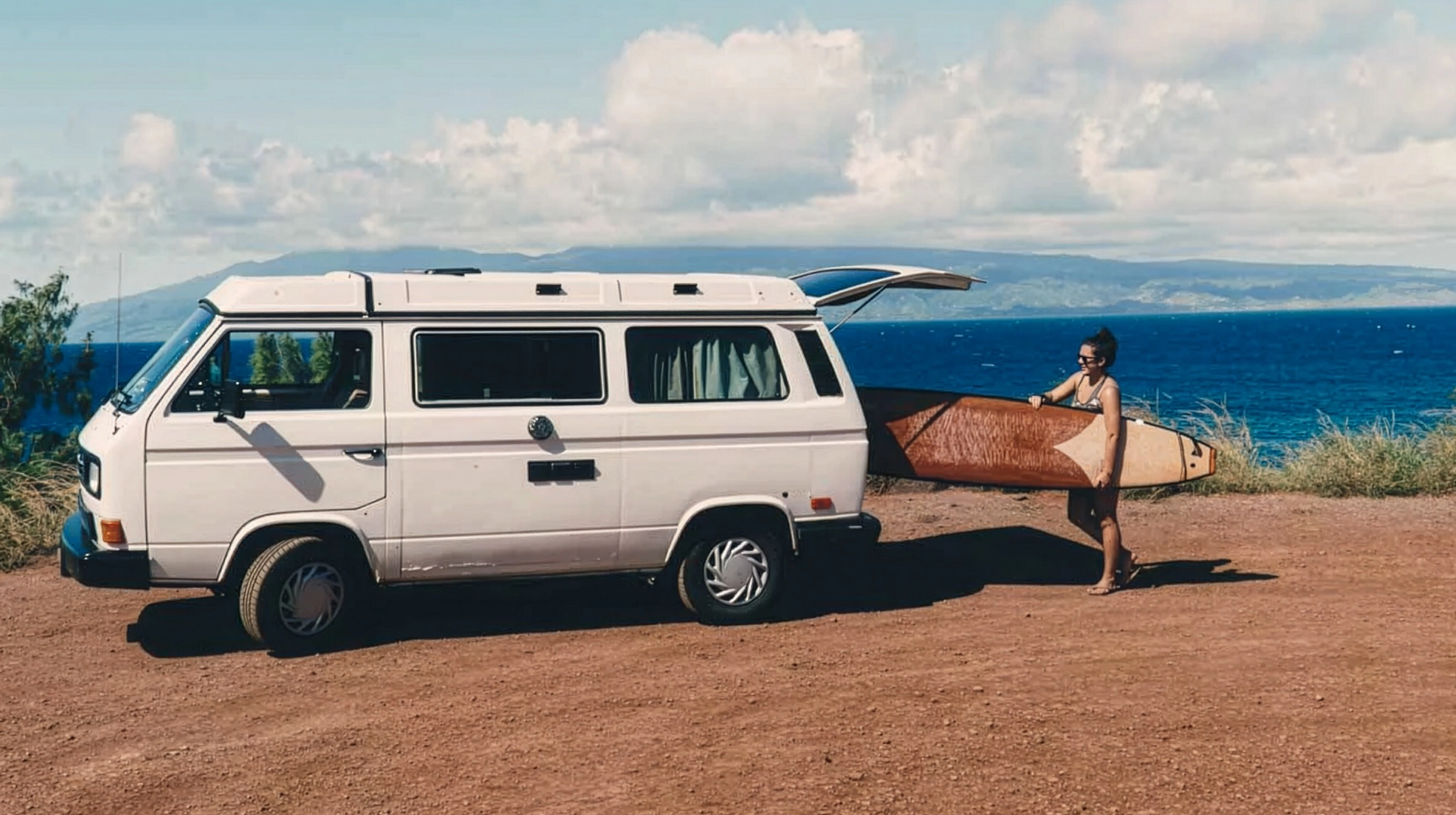
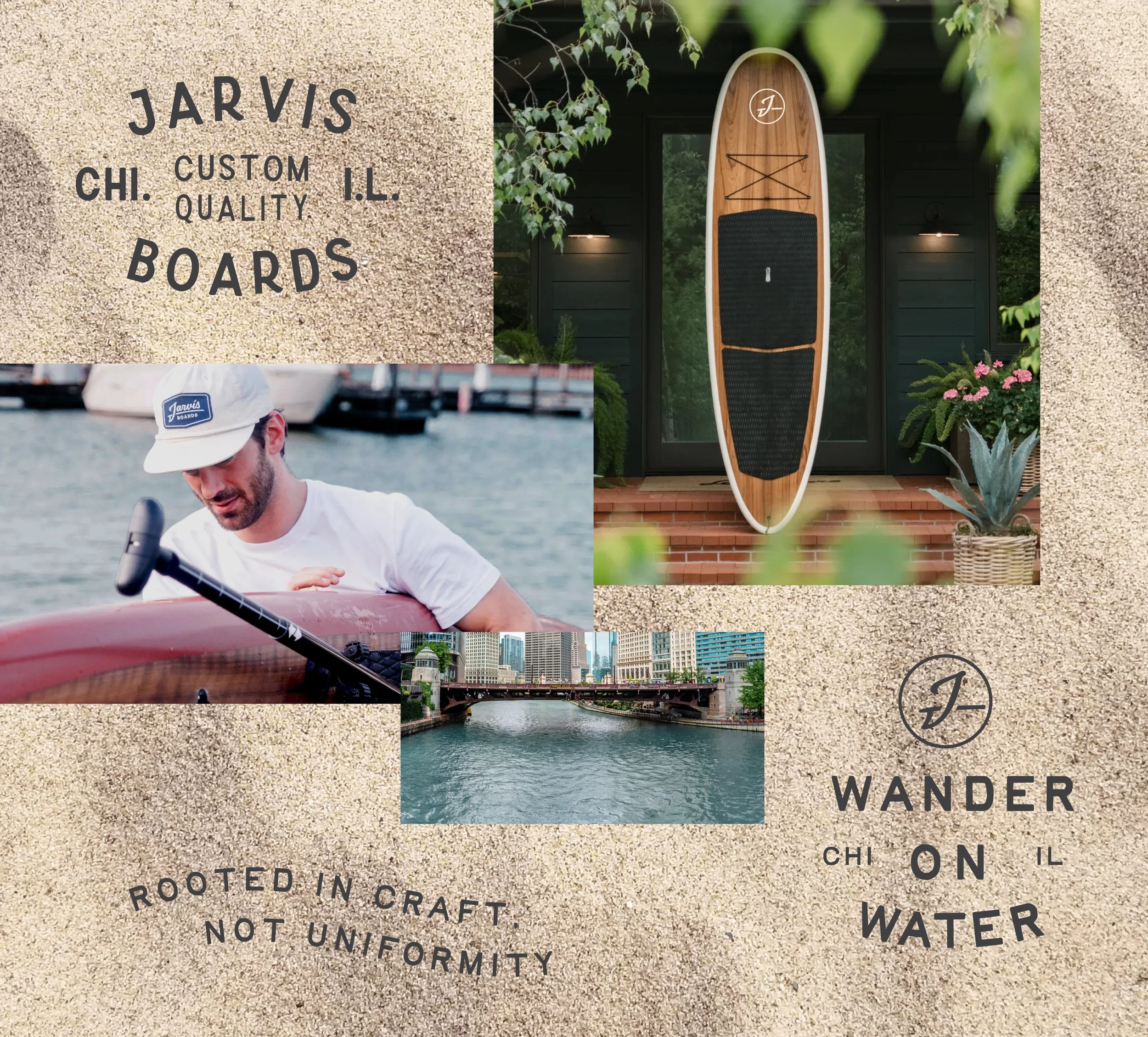
Originally founded as a wooden paddleboard kit company in Texas, Jarvis helped thousands of hobbyists and woodworkers build their own boards from scratch. But Eric saw the potential to evolve the business beyond kits and into a premium American craft brand—one that celebrated woodworking, performance, heritage, and life on the water.
HiFi Brands partnered with Jarvis Boards to develop a new identity system that honored the company's roots while repositioning it for its next chapter.
-
Strategy
Verbal Identity
Brand Identity
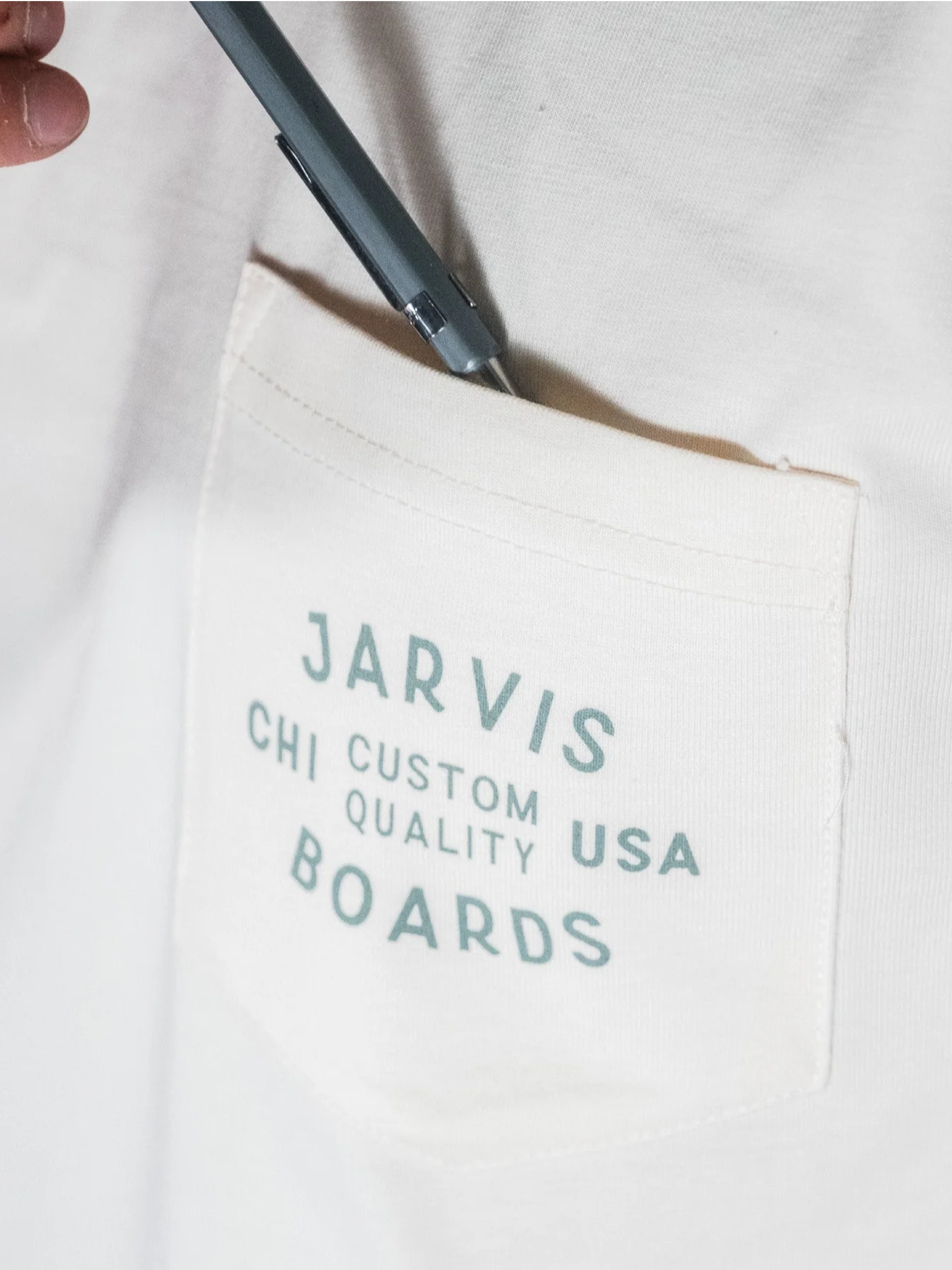
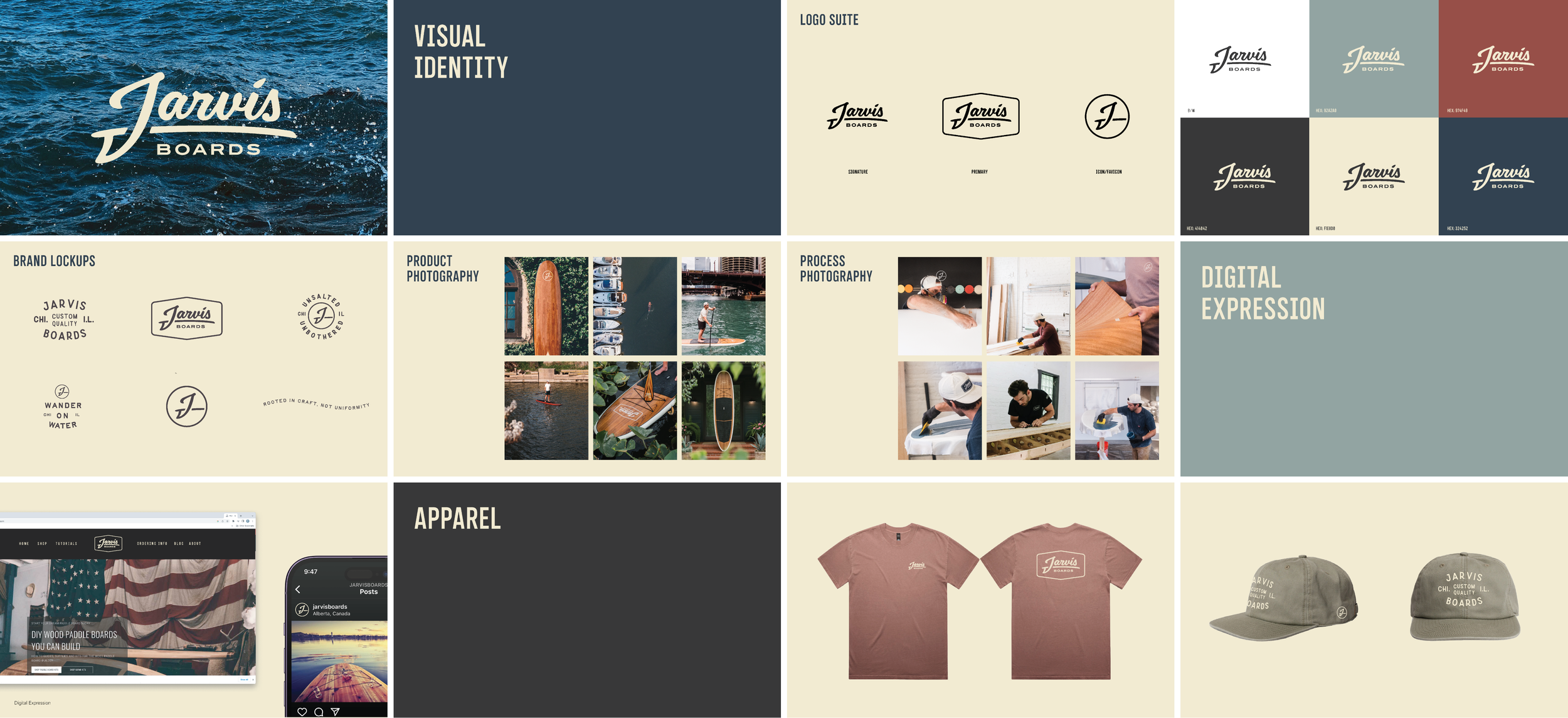
Apparel
-
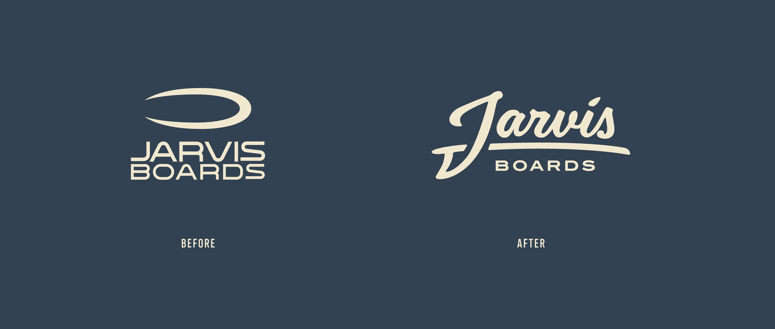
The existing Jarvis Boards identity reflected the company's origins as a DIY board-building kit business. While it successfully connected with makers and hobbyists, it lacked the presence and emotional depth needed to support the new owner’s broader vision for the company.
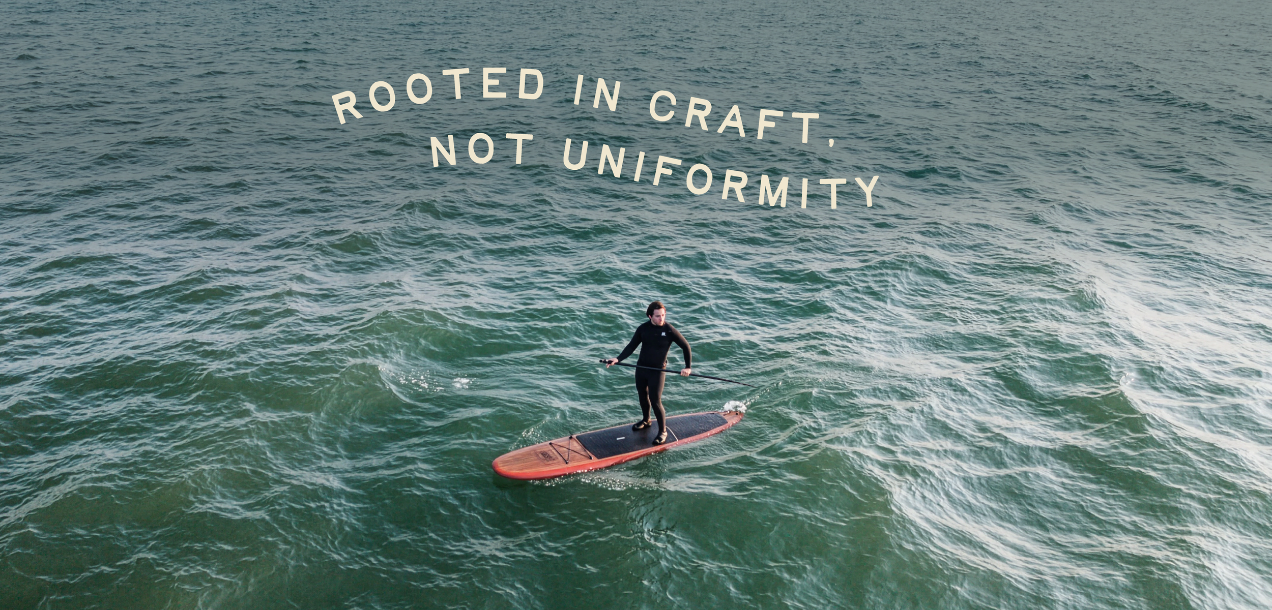
As Jarvis expanded into custom paddle boards and heirloom-quality surf craft, the brand needed to communicate a higher level of craftsmanship, quality, and permanence. It needed to feel less like a project and more like an institution.
-
The original business sold DIY kits, but what attracted Erik to Jarvis—and what attracted customers to the brand—was a deeper appreciation for making things by hand, working with natural materials, and spending time outdoors. The board itself was simply the expression of those values.
-
HiFi Creative Team
Allison Rosenwinkel — Brand Strategy
Paul Demyanovich — Creative Direction & Identity Design
Frank Castaldi – Typography
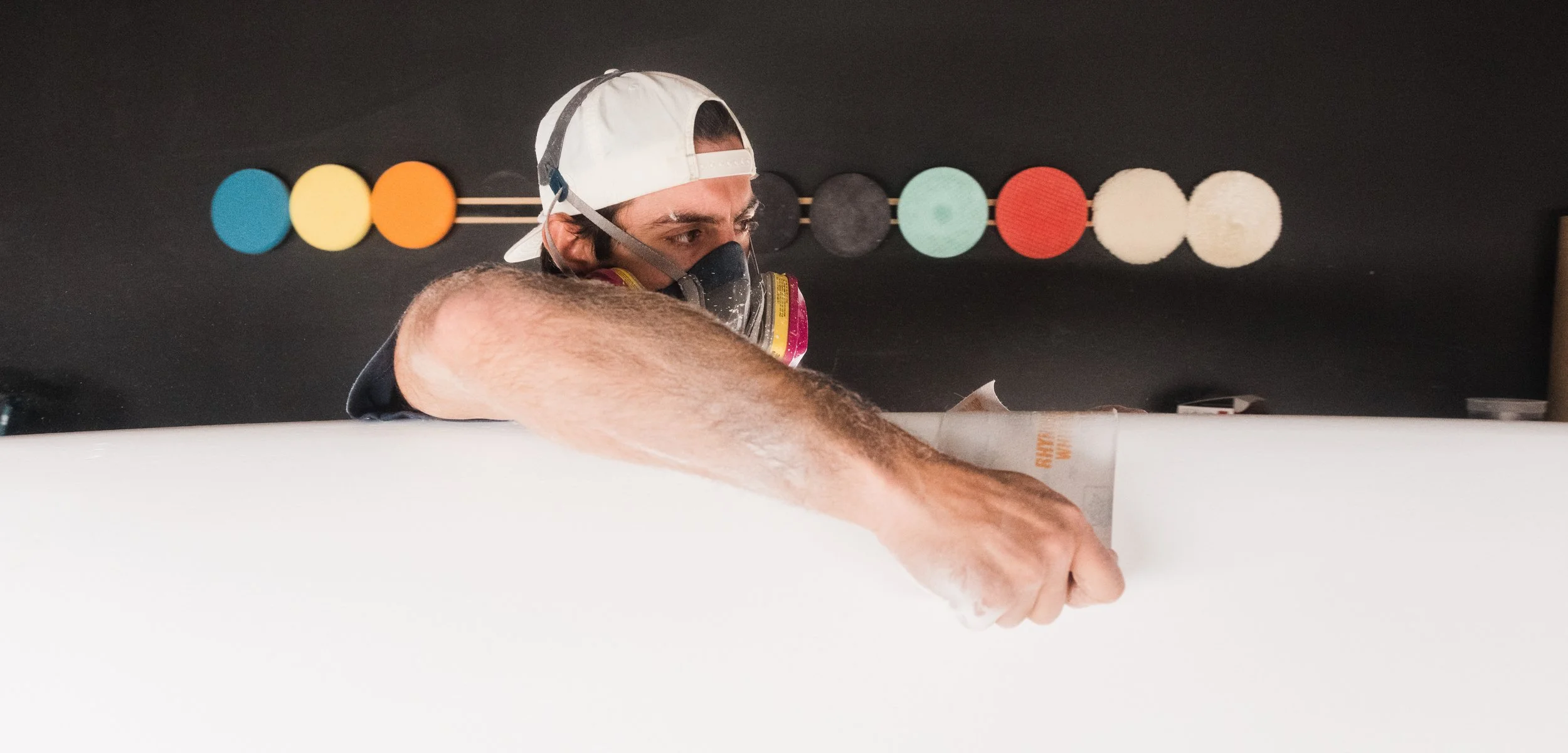
Crafting the Identity System
Designed to feel understated, hardworking, and enduring.
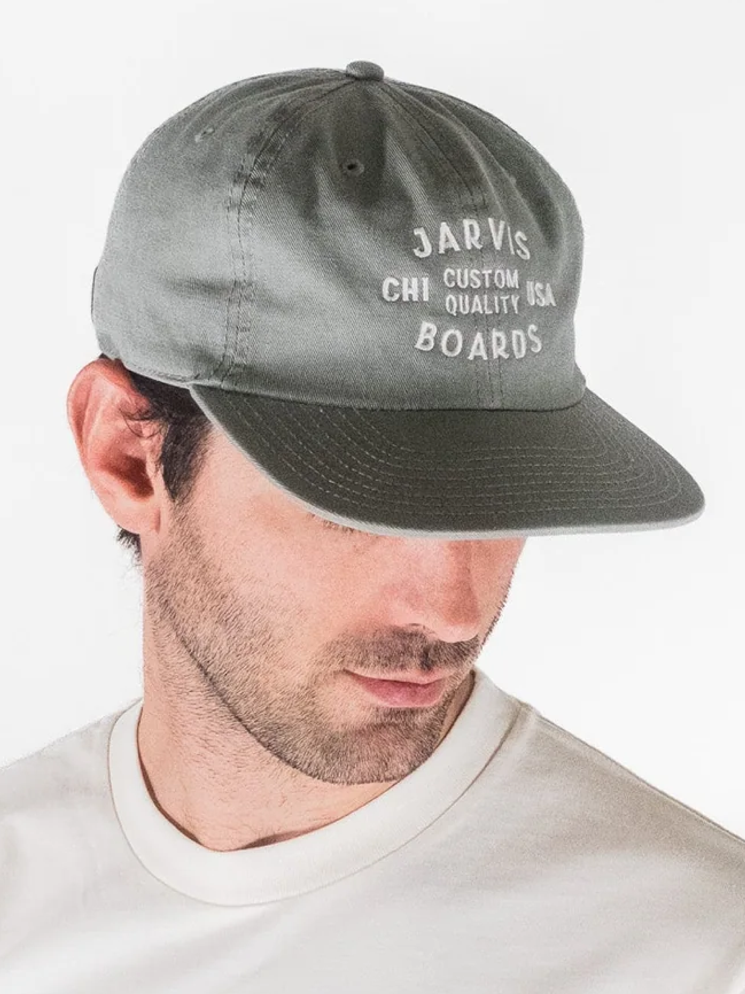
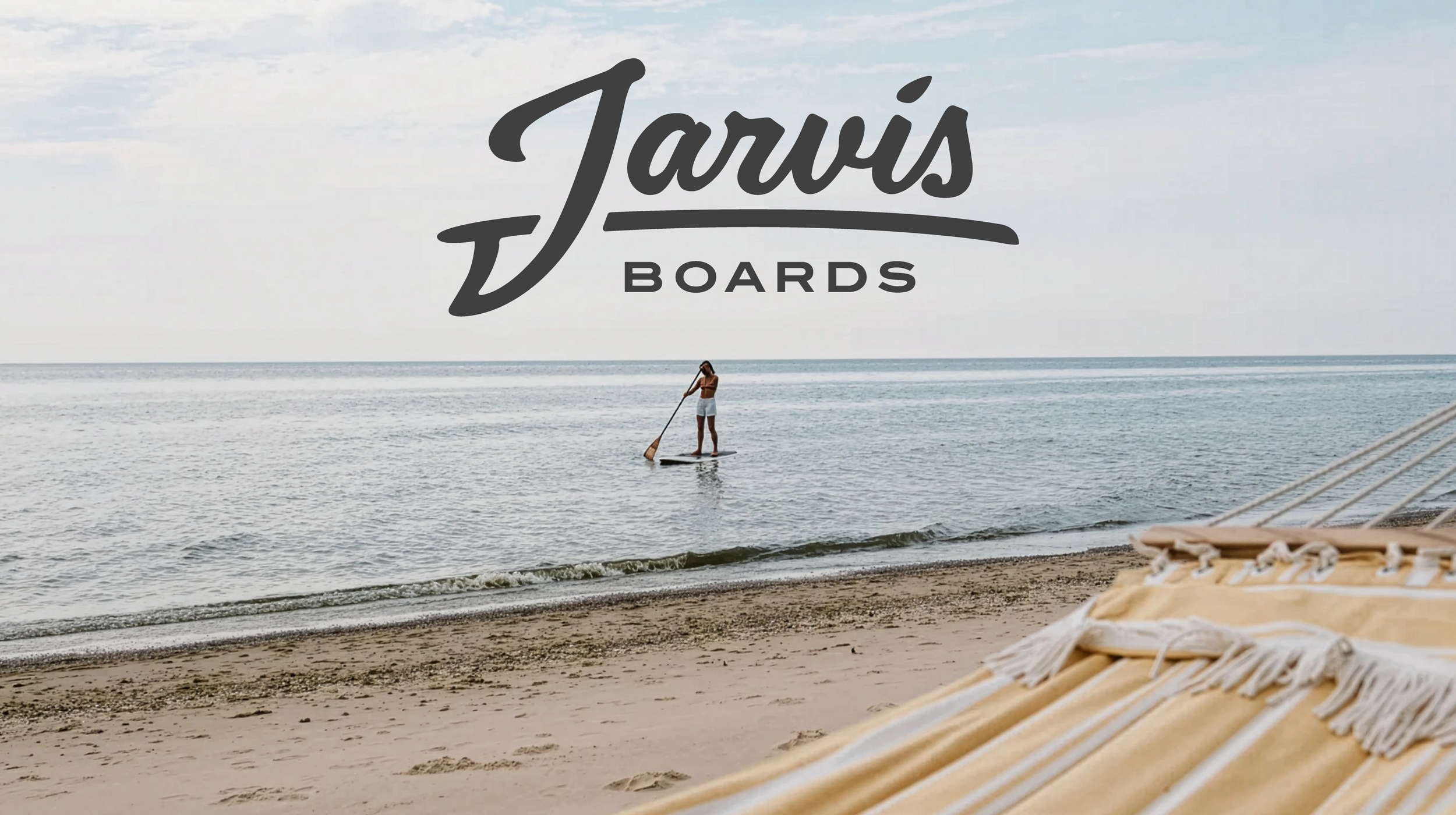
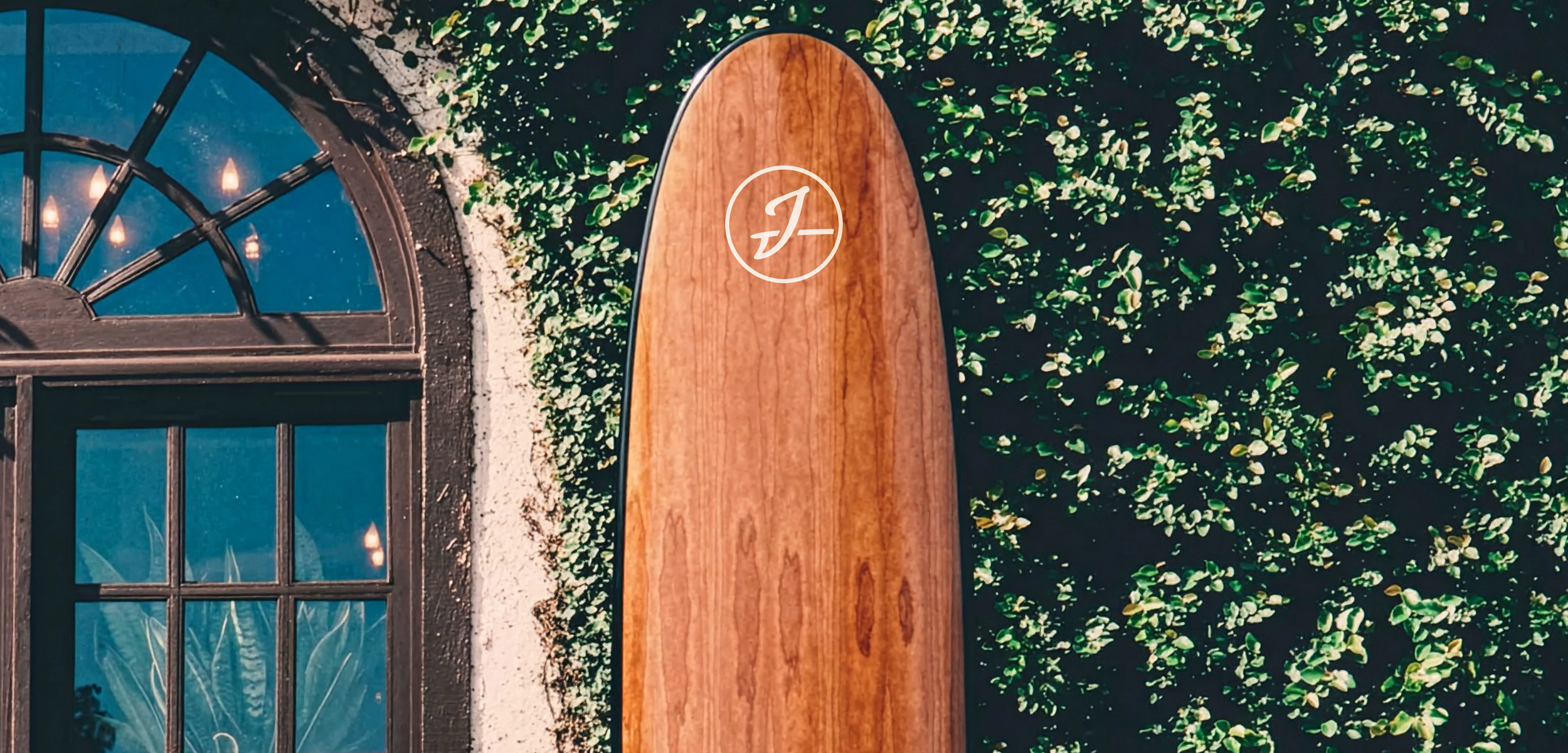
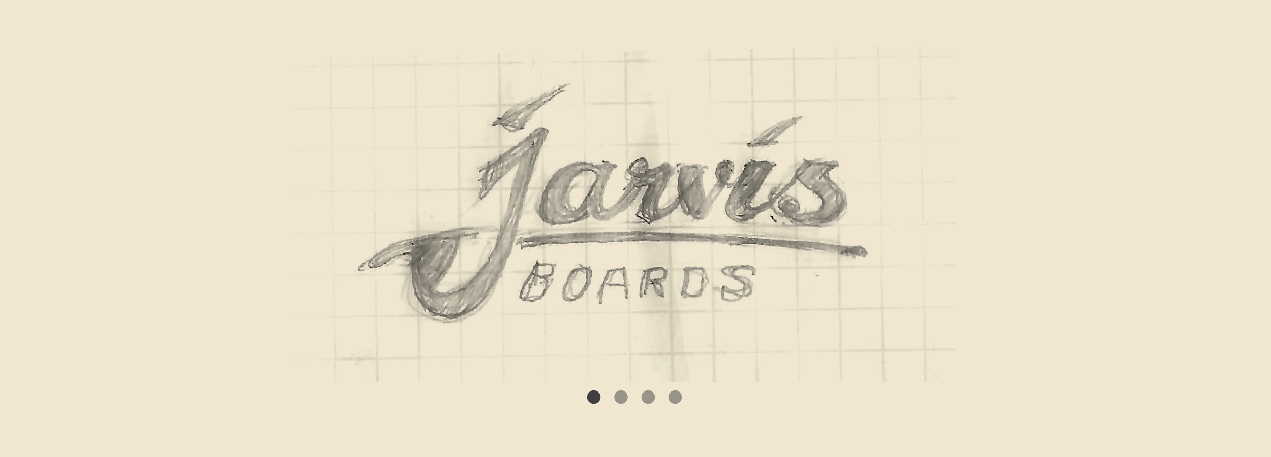
Inspired by classic surf brands, heritage boating companies, and iconic American makers, the identity system was designed to feel understated, hardworking, and enduring. The custom logotype balances precision and warmth, drawing from vintage marine emblems and traditional craftsmanship marks while avoiding overt nostalgia.
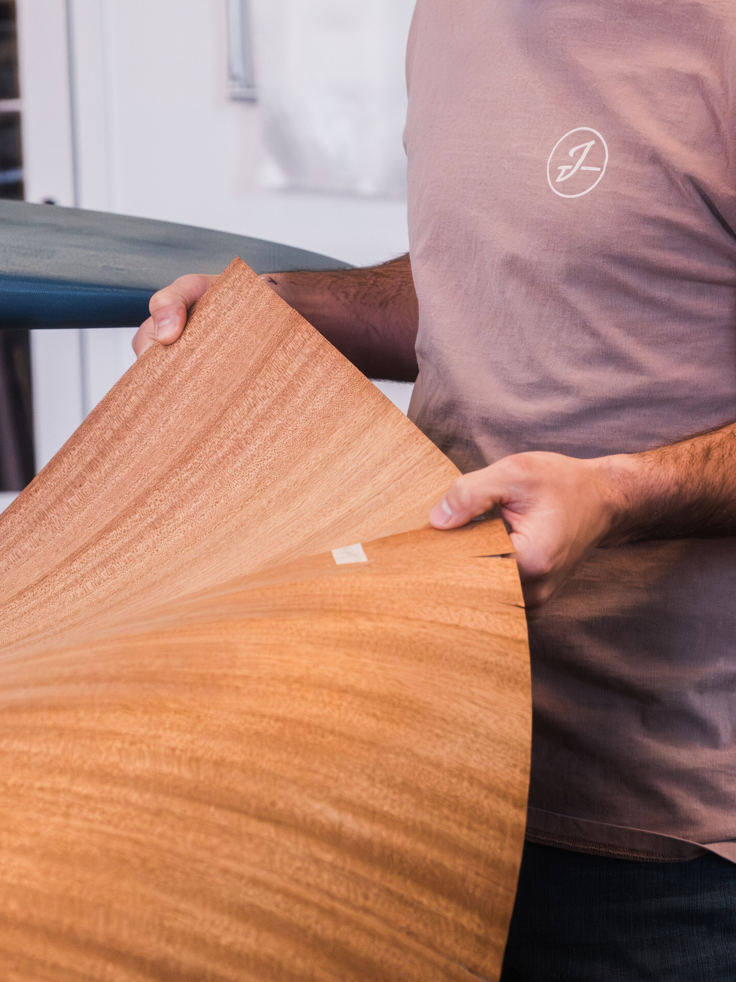
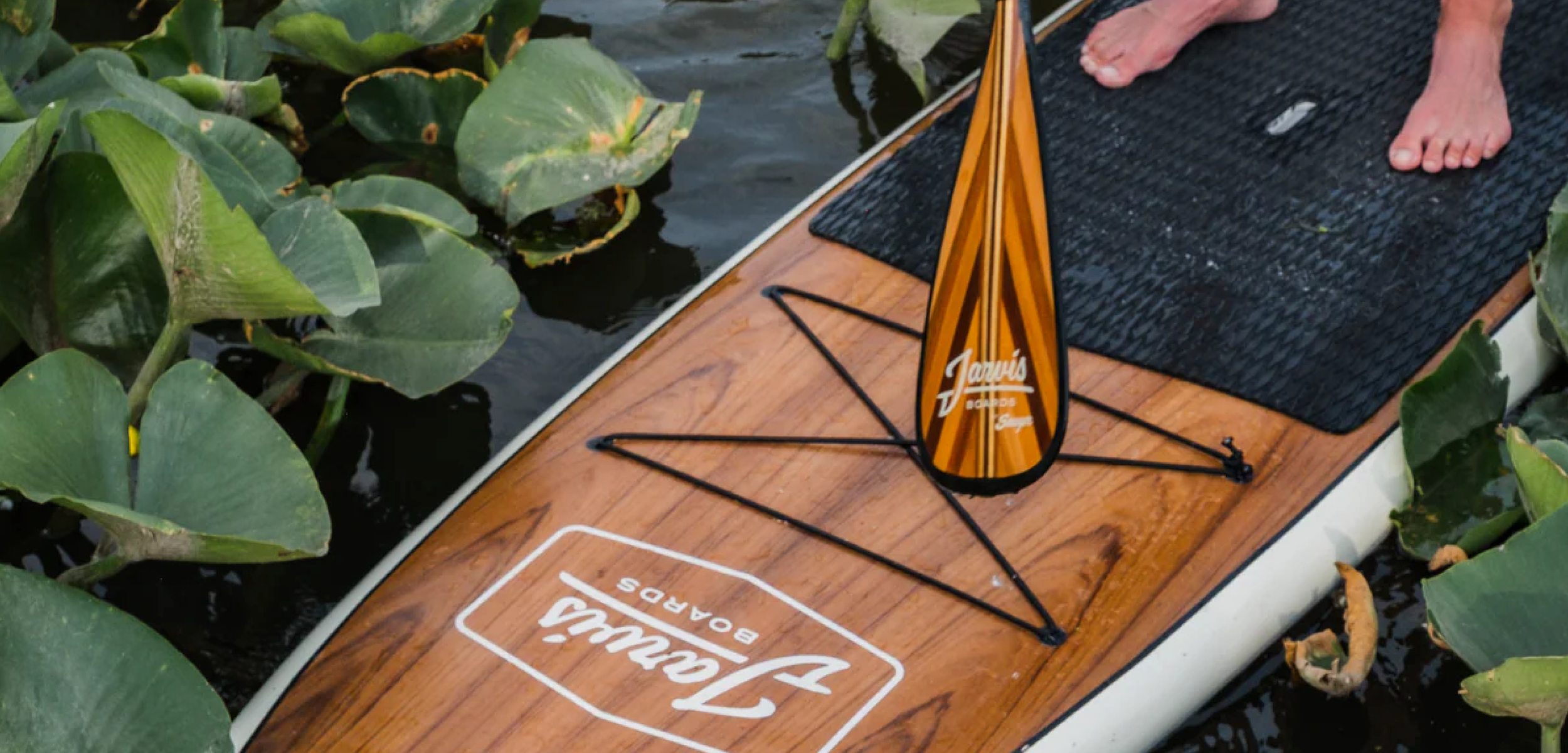
At the heart of the system is a custom "J" icon inspired by a board's skeg—or fin—transforming a functional paddle board design elemnt into a distinctive brand mark that symbolizes direction, performance, and craftsmanship. This subtle detail creates a direct connection between the identity and the product itself, reinforcing Jarvis' commitment to thoughtful design and the art of making.
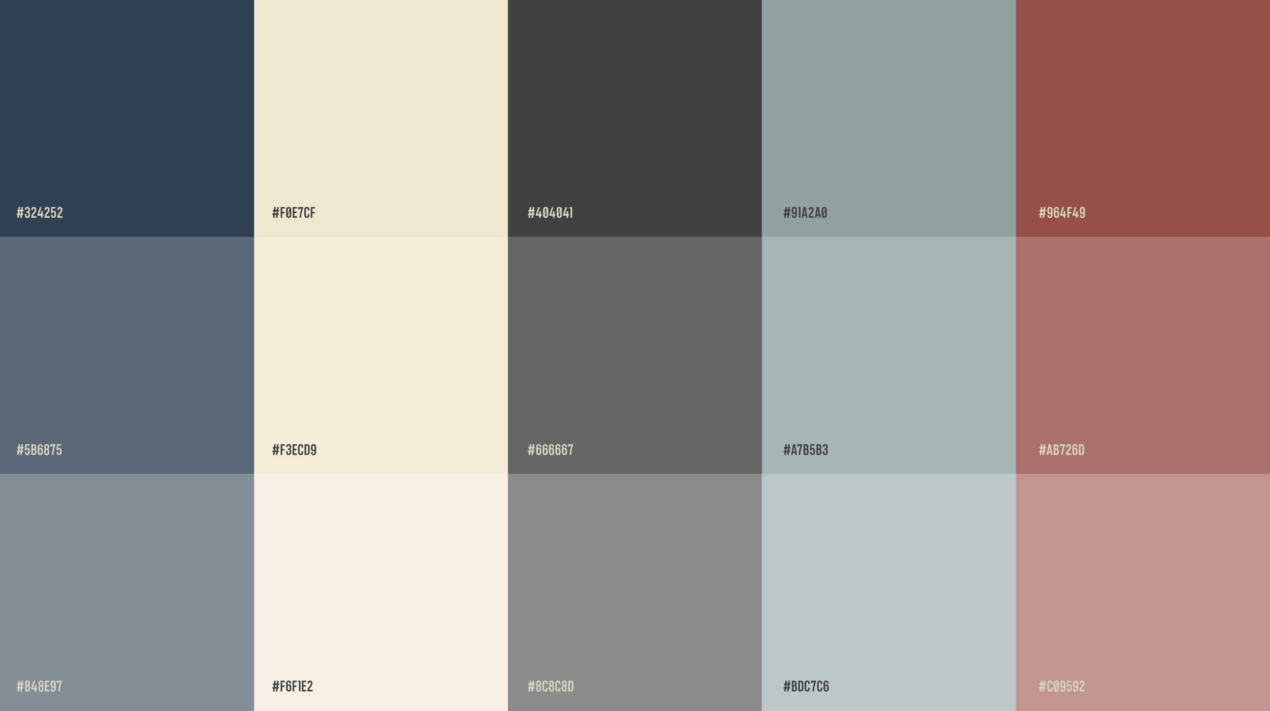
A restrained palette of muted, natural tones complements the warmth of wood and handcrafted materials, while timeless typography helps position Jarvis as a modern heritage brand built on quality, authenticity, and enduring craftsmanship.
"HiFi helped transform Jarvis from a DIY paddle board company into a premium craftsmanship brand. The new identity captures everything we stand for today while honoring where we came from."
— Eric Roberts, Owner & Operator, Jarvis Boards